
When I look at Alessandra Branca's interior designs I honestly can't put my finger on what it is that I love so much about her concept, the best way I can describe what I see in her designs is that... "she runs with it". As you look below at her designs I think you will understand what I mean, but let us begin with the living-room pictured above, in this room Branca ran with the idea of "mixing it up", the tall twig centerpiece can very well be described as contemporary compared to her circular carved wooden side-table and twin turquoise vases on the wall which would be described as ethnic. Her twin turquoise arm chairs on the far wall contain an essence of period piece furnishings from the 18th century, on the other hand the sofa and armchair set looks very much "today". All the pieces that make up the living-room are indeed different in time and design and yet Branca has gathered them together in this single room to create a space that looks not disordered but intriguing to the eye.
"Uniform, even and proportionate" is also something Branca likes to play with in her designs, pictured below you'll find two rooms in which mirroring seems to be quite apparent, and then you will see a key feature in the rooms that will throw this idea of "mirroring" off, a rather sophisticated way of toying with our brains... but I also believe it makes the look and feel of the room as a whole, fun and quirky.
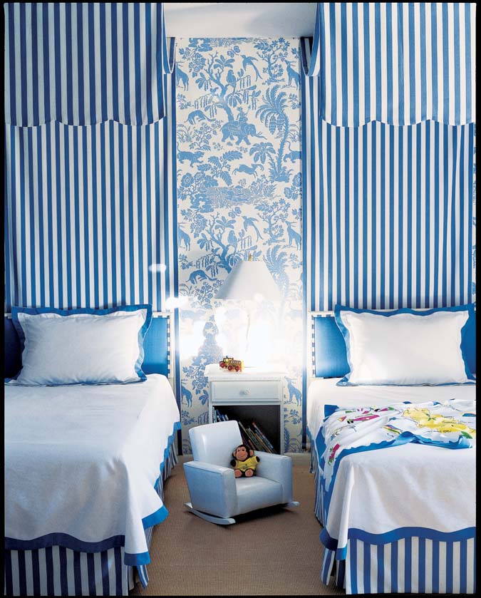 |
| The blue vertical lines v.s. the animal & tree wallpaper at center |
 |
| The glass side table to the left & the orange-glowing chandelier plays with the room's proportionate features |
Wallpapers are always fun and interesting to make the spotlight of in a particular room. And from looking at the two wallpapers below it seems Branca has a thing for birds and elegance which she has extended throughout the bedroom (pictured below) using light airy colors allowing the wallpaper to be the key feature.


Branca has a way with space arranging sitting area(s) in the least likely position, using corners to create a more homely and comfortable space is something that Branca did in her below pictures.


My favorite is pictured below, Branca uses a colorful sofa bench against the black and white tiled entry way. The stark contrast between the look and the design of the bench against the tiled flooring is eye-candy to me.

Alessandra Branca.com