Showing posts with label All decor. Show all posts

A Parisian Apartment for the American Couple

Using Black


When I wanted to paint the doors of our house black my husband strongly urged me not to do so, so when I tried Plan B: to paint the moldings black, my husband once again urged me strongly not to do so.  When I asked him his reason for this definitive acrimony for the color black he simply stated that he felt black was a depressing color, a color of death and so on.  Black may be linked to many negative connotations and in many ways this link is very true but that doesn't mean black can't be a wonderful color for the home, in truth, using black in the home can be quite chic and even charming.


THE DOORS

Painting the door(s) glossy black can be quite the way to make a chic statement and also a wonderful way to incorporate black with standing power without having to have black walls (which for many can be a bit over-whelming, especially if it's the first time your using this color).  With black doors a simple black accent here and there in forms of pictures frames, shelving and even a wall full of black and white photos can really tie the room into a black-color theme that is exciting and smart.
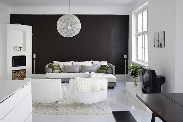

THE LIVING AREA

Using black as an accent to one large space is not only a great way to incorporate the color with the lease amount of work but it's also quite chic.  Try an accent wall or even better (as pictured below) accent flooring!  One of the great aspects of taking the route of accenting with the color is that you'll find that you have more options when figuring out the decor style of the room (ie modern, rustic, etc.) and it will also give you more free reign on incorporating a variety of other colors if you wish to do so.


FAVORITE!

The pairing of mahogany and black is glamourous and exquisite, pairing the two can cover a wide spectrum from rustic (pictured above) to eclectic high-end living (pictured below).


THE KITCHEN

Although it's no favorite of mine modern minimalism is probably one of the most popular ways to use black in the kitchen.


Using reflective black (or better known as glossy black) in the kitchen can be quite exciting in that the reflective black can really amp up the look of the kitchen creating an almost futuristic vibe even in contemporary kitchens (as seen above).

When comparing the picture above and below one can compare and contrast the similarities and differences of the kitchen.  Both kitchens which have reflective black surfaces are switched in floor colors and ceiling colors; the kitchen pictured above has matte white ceilings and a reflective dark gray floor while the kitchen pictured below has a reflective black ceiling and matte white flooring.  The matte of the white ceiling creates a more closed-in atmosphere while the reflective black ceiling make the space feel more open and grand.  I find this comparison to be quite interesting since it is normally the darker colors that create the illusion of a smaller space, just goes to show the power of gloss.


FAVORITE!

My favorite use of black in the kitchen is pictured above, the rustic-styled kitchen.  I honestly didn't think using black to create a rustic kitchen was possible, but it is!  The two tones of black: the black walls and dark gray shelving and cabinets creates depth and a feeling of space, the black and white kitchen floor tiling are in a couple different styles, but the combination of different tiles being used creates the feeling of a fun, creative space.
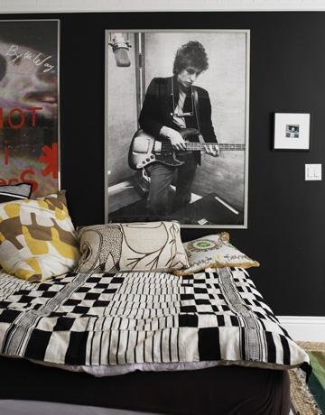

TEEN ROOMS

Not all teens with black walled rooms are going through teen-angst.  There are plenty of youthful prints and materials out there to scream teen-chic rather than "I lock myself in my room and play tearful hate music on my free time" for example, the checkered print, a vintage yet youthful print that is fantastic for teen rooms. Silver or anything close to is a great material that is youthful and goes well black in teen rooms.  Pops of bright color is another great way to incorporate fun and teen rooms can totally get away with most colors that are simply strewn about.


KID ROOMS

And while some parents are debating with their teens about their black rooms these same mas and pas won't think twice about saying "NO" to their baby's nursery being black.  Who would want their little mini-me to be influenced by the negative nature of the dark color?!  Well, there are ways to brighten up black.  And there probably is no better way to make a statement than taking black and turning it around.  A few adorable, smart and chic ways to use black in the nursery are pictured here.

When using an accent color for the black nursery, yellow is always a great color; so bright that even black loses it's dull negativity, when paired together yellow is more robust and popping and black seems to be the accent.


Leaving the white ceiling is another common trick to keeping the space looking a little less black and more open.  Of course, fun prints and bright colors help a lot too.


USING PRINT

And by golly don't forget about wall paper, stencils and other fun ways to use black.  Wall paper is a great way to incorporate print over a large space. 


The black and silver floral wall paper can catch people unawares but it is never-the-less quite beautiful in its non-traditional way.  Contemporary wall papers (such as the one pictured below) of the alphabet is fun and can easily transform a rather plain space.


Using White

GETTING PSYCHOLOGICAL WITH ACCENT COLORS
The use of a large black painting gives color and serves as an accent in the all white room, picture the room without the painting... And now see it with the painting.  The white seems whiter with the black painting while picturing the room without the painting results in a washed out room.

I think that the majority of the masses believe white to be not a color, although to have any hue at all including what the masses believe to be the absence of hue, white, is a color. And while most people might say that white is not a color, here are a few spectacular, beautiful, stunning and unique ways to establish white as the main color of your home or room. Boring?... Hardly!

One of the easiest ways to draw the eye to notice white is using accents, you may think this absolutely absurd because the whole point of using accent colors in the home is to draw attention to the accent color. Actually, one can use accent colors to cheat the brain of the viewer by giving the viewer a color to compare (via contrast) the white to, hence the white will seem whiter and the viewers will see 'that yellow wall in the all white room'.

In conclusion, using a color accent in a counter-intuitive manner will draw attention to the white room, this kind of reverse psychology play with the use of colors goes for all colors and not just white, although I find it to be most intriguing with white since it seems to have the biggest affect- POW! 

The black accent wall matches the dark wooden dining table as well as with the other small black items in the room. The white rug, pendant lamp and floors stand out from the accent wall thus showing us the importance of white in the room's decor.

The natural redbrick wall between the windows is being smartly used as an accent wall.

FAVORITE!
Another way to use accent colors is through the use of the floors, in this case the kitchen floor is black and white checkered highlighting the white everywhere else.


WAYS TO USING A SECOND COLOR THOROUGHLY
The large use of earth tones, in this case wood, highlights what isn't wood, which is white. By evenly dispersing white in lieu of the wood gives the white within the space notice although there is just as much as wood. White is also a brighter color than wood, hence the eye is deceived by thinking white is the main color even though there is obviously more wood tones in the space.

There is no better color to highlight white than black as it is its extreme opposite, however, there is a risk of black taking away the notice on the white, black is a powerful color afterall. Using black trim for white walls is never-the-less a very chic way to go while keeping your white walls.


PLAYING OFF THE FLOORS
The white flooring that extends to the walls creates an illusion of lightness, the black highlights the lightness while the gray takes the edge off the stark contrast of the black versus white. The white however easily overcomes and overtakes the black accents in the room due to the white flooring which keeps the room bright, light and airy and the notice on the white in the space.

Floors matter a great deal, they take a great amount of space in the house and because of this one simple fact (although probably not the only one) makes floors something to be respected, noticed and regarded when creating the interior style for your home or room.

The white against the brown wood floors accented with green creates a very delightful, cozy and familiar space. The white walls together with the white bedspread creates a very stark white affect against the wooden floors which can be taken notice through the smart use of green accents which can be viewed as being an accent color for both the white and the wooden floors, hence the green accent serves as a type of middle ground or bond between the wooden floors and the white in the space.

The light pinkish-nude tones of the flooring is taken into consideration via the framed picture above the bed which also exudes the same tones. The paleness of both these two different white tones is use congruently to create an ethereal effect that is light and soft, the theme of this room.


USING NATURAL LIGHT ON DIFFERENT WHITE TONES TO CREATE ILLUMINATING EFFECTS
The absence of any other color in the room together with white walls that holds more warm tones when lighted up creates an ethereal effect that is fantasy-like and heavenly.

I have a Marmalade orange office that looks dark orange in the evenings and very orange during the day, this change in color due to the changing natural light occurs with all colors, including white. While many try to pick colors as accurately as possible keeping in mind natural light and its affects on the colors of the walls many do not think that this affect is also interesting to play with. However it can be quite beautiful and smart when used to your advantage.

Some whites will have more blue tones in which case the room will appear to be more bluish when the light hits. The overall appearance of this kind of illumination has a cool (colder) affect which is most often exhibited in the modern uses of white, in this case the modern illumination in white is kept grounded and earthy by the wooden floors and the large wooden living room table which also serves as the center pieces of the entire room.


DIFFERENT STYLES FOR WHITE
White and modern (futuristic) seem to go quite well together, hand-in-hand actually, modern interior styles is built off the characteristic of simplicity; a modern quality. Hence there is no other color better than white for this style of interior decor, and when used for modern purposes exudes a type of pureness of modernity that is lacking when using any other color.

Using white for contemporary spaces is always interesting to see and quite hard to achieve since white gives off the impression of modernity (futuristic); there is a thin line between using white in a modern style and using white in a contemporary style. The handles on the cabinetry, semi-polished wood flooring and exposed storage rack all combine to create a more contemporary look in the white kitchen; the distinction is very subtle but there.  Look closely at the modern kitchen above and the contemporary kitchen, notice the slight differences that make one contemporary and the other modern.

FAVORITE!
One of my favorite ways of using white is using it to highlight a rustic interior style. In combination with distressed pastel colored furnishings and a rustic wood-topped island center piece the white is used to highlight these attributes though white is itself a highlight in color in the kitchen. The use of a white with more blue tones also gives off a more cooler atmosphere that works well with the gray distressed cabinet and the other white tones in the room, this tone of white also gives a bright overall appearance that adds a bit of modern brightness to a very rustic interior decor, an intriguing combination that results in an unique charm.


USING DIFFERENT MATERIALS TO ACHIEVE THE WHITE
White hanging lights, white marble top on a white island, white marble walls with white trim, white countertops on white cabinetry. The white is then highlighted by the wood and the black and white striped kitchen rug that is connect to the rest of the room by the matching white and black striped glassware on the counter. The results is a kitchen that  is fun, light and eccentric in character.

One mustn't forget other materials that can help you achieve the white room, this will also add different textures to the room which can be quite satisfying. Sometimes all white rooms with lack of textures from lack of different materials present can result in a washed out interior style, in other words, boring. Then again, sometimes this is exactly what the doer wants- which is fine if that is the overall look you're going for.  I find that while it may be more difficult to use different materials in the living room, dining room, entry and bedroom the kitchen and bathroom are two spaces where using different materials is quite easy, all that countertop, sinks and backsplashes are all just asking for it aren't they?  And the end result is always so charming.

FAVORITE!
The counter to ceiling subway tile walls is absolutely charming. The dark grout between the subway tiles matches the black accent of the island and the countertop. Note that the countertop is also white&gray marble and the brass fixtures give the kitchen a class all its own.  The many different materials of white come together to create a wholly white kitchen with black and brass accent, absolutely lovely.


DINING WITH A BACKDROP OF COLORS AGAINST WHITE
FAVORITE!
The combination of the contemporary dining table with a backdrop of colorful books and things against the forefront romantic large chandelier results in a romantic and eccentric atmosphere. The colorful backdrops keeps the room fun, grounded and also keeps the dining area from being overly-romantic.

There is nothing like a rainbow of colors to serve as your accent wall to remind you that you're surrounded by white.  


REMEMBER THAT OTHER COLORS GO WELL WITH WHITE TOO
The use of purple with white is very romantic and unique.

Many seem to jump to black or brown when highlighting white, black probably because it's the exact opposite of white and everyone likes stark contrast to make a statement.  Brown is often used as well most likely because everything goes with brown and also it's a very good way to keep things grounded and earthy if that is the kind of style you gravitate towards. But I'm here to tell you that there are tons of other colors that go well white... like every other color, I mean this quite literally.  Many believe that white is the absence of color, this actually is not true- black is the result of absence of color, white is the exact opposite; white is the result of the combination of all colors, hence my theory that white goes well with every color.

The use of yellow results in a fun and quirky atmosphere that screams "easy going!"


Paul Loebach furniture & designs

Orchard Ladders
18 x 1.5 x 78 in / 10 x 1.5 x 130 in / 44 x 1.5 x 61 in
Produced by Matter

The work of Paul Loebach first caught my eye when I did a short post on the Paul Loebach Credenza featured in West Elm, the design was simple and yet the detailing was something to talk about - this is what I immediately liked about Paul Loebach's design.  Naturally I looked into Paul Loebach further, and was pleasantly surprised.  Paul Loebach is not a fleeting designer, it does indeed seem, that he is here to stay as most innovative and out-of-the-box designers are.  The quality of Loebach designs is comparable to that seen in DWR (Design Within Reach) stores but the designs lean more towards a warmer and welcoming atmosphere.


Orchard Ladder


The Orchard ladder was inspired by 19th-century orchard equipment.


Tocotta & Fuga

Tocotta & Fuga
25 x 20 x 28 in
Produced by Billiani


The Tocotta & Fuga chairs are made via computer driven machinery that "articulates the contoured parts including classic mortise and tenon joinery" Paul Loebach.


Step Stools

Step Stools
25 x 20 x 28 in
Produced by Areaware


The Step Stools were inspired by the versatility of the American Shaker furniture.


Wood Vase

Wood Vases
6 x 6 x 10 in


The Wood Vases are the results of an experiment in wood construction and CNC machining.  Where the design of the vases articulates the profile of the polymorphic shapes through the 'parting line'.


Shelf Space

Shelf Space
45 x 12 x 21 in


The Shelf Space is the result of an experimental collaboration with an aerospace machinery manufacturer.


LinkWithin

Related Posts Plugin for WordPress, Blogger...