
Eclectic fun living-room decor.
Absolutely beautiful.
 |
| The use of a large black painting gives color and serves as an accent in the all white room, picture the room without the painting... And now see it with the painting. The white seems whiter with the black painting while picturing the room without the painting results in a washed out room. |
 |
| The black accent wall matches the dark wooden dining table as well as with the other small black items in the room. The white rug, pendant lamp and floors stand out from the accent wall thus showing us the importance of white in the room's decor. |
 |
| The natural redbrick wall between the windows is being smartly used as an accent wall. |
 |
| Another way to use accent colors is through the use of the floors, in this case the kitchen floor is black and white checkered highlighting the white everywhere else. |
 |
| The large use of earth tones, in this case wood, highlights what isn't wood, which is white. By evenly dispersing white in lieu of the wood gives the white within the space notice although there is just as much as wood. White is also a brighter color than wood, hence the eye is deceived by thinking white is the main color even though there is obviously more wood tones in the space. |
 |
| There is no better color to highlight white than black as it is its extreme opposite, however, there is a risk of black taking away the notice on the white, black is a powerful color afterall. Using black trim for white walls is never-the-less a very chic way to go while keeping your white walls. |
 |
| The white flooring that extends to the walls creates an illusion of lightness, the black highlights the lightness while the gray takes the edge off the stark contrast of the black versus white. The white however easily overcomes and overtakes the black accents in the room due to the white flooring which keeps the room bright, light and airy and the notice on the white in the space. |
 |
| The white against the brown wood floors accented with green creates a very delightful, cozy and familiar space. The white walls together with the white bedspread creates a very stark white affect against the wooden floors which can be taken notice through the smart use of green accents which can be viewed as being an accent color for both the white and the wooden floors, hence the green accent serves as a type of middle ground or bond between the wooden floors and the white in the space. |
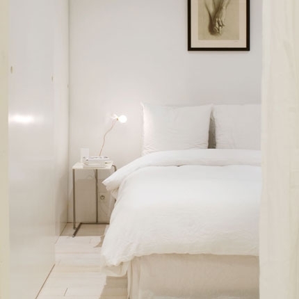 |
| The light pinkish-nude tones of the flooring is taken into consideration via the framed picture above the bed which also exudes the same tones. The paleness of both these two different white tones is use congruently to create an ethereal effect that is light and soft, the theme of this room. |
 |
| The absence of any other color in the room together with white walls that holds more warm tones when lighted up creates an ethereal effect that is fantasy-like and heavenly. |
 |
| Some whites will have more blue tones in which case the room will appear to be more bluish when the light hits. The overall appearance of this kind of illumination has a cool (colder) affect which is most often exhibited in the modern uses of white, in this case the modern illumination in white is kept grounded and earthy by the wooden floors and the large wooden living room table which also serves as the center pieces of the entire room. |
 |
| White and modern (futuristic) seem to go quite well together, hand-in-hand actually, modern interior styles is built off the characteristic of simplicity; a modern quality. Hence there is no other color better than white for this style of interior decor, and when used for modern purposes exudes a type of pureness of modernity that is lacking when using any other color. |
 |
| Using white for contemporary spaces is always interesting to see and quite hard to achieve since white gives off the impression of modernity (futuristic); there is a thin line between using white in a modern style and using white in a contemporary style. The handles on the cabinetry, semi-polished wood flooring and exposed storage rack all combine to create a more contemporary look in the white kitchen; the distinction is very subtle but there. Look closely at the modern kitchen above and the contemporary kitchen, notice the slight differences that make one contemporary and the other modern. |
 |
| One of my favorite ways of using white is using it to highlight a rustic interior style. In combination with distressed pastel colored furnishings and a rustic wood-topped island center piece the white is used to highlight these attributes though white is itself a highlight in color in the kitchen. The use of a white with more blue tones also gives off a more cooler atmosphere that works well with the gray distressed cabinet and the other white tones in the room, this tone of white also gives a bright overall appearance that adds a bit of modern brightness to a very rustic interior decor, an intriguing combination that results in an unique charm. |
 |
| White hanging lights, white marble top on a white island, white marble walls with white trim, white countertops on white cabinetry. The white is then highlighted by the wood and the black and white striped kitchen rug that is connect to the rest of the room by the matching white and black striped glassware on the counter. The results is a kitchen that is fun, light and eccentric in character. |
 |
| The counter to ceiling subway tile walls is absolutely charming. The dark grout between the subway tiles matches the black accent of the island and the countertop. Note that the countertop is also white&gray marble and the brass fixtures give the kitchen a class all its own. The many different materials of white come together to create a wholly white kitchen with black and brass accent, absolutely lovely. |
 |
| The combination of the contemporary dining table with a backdrop of colorful books and things against the forefront romantic large chandelier results in a romantic and eccentric atmosphere. The colorful backdrops keeps the room fun, grounded and also keeps the dining area from being overly-romantic. |
 |
| The use of purple with white is very romantic and unique. |
 |
| The use of yellow results in a fun and quirky atmosphere that screams "easy going!" |
 |
| The brown faux-trim to create a more defined space for the framed pictures is a beautifully smart way to draw the eye. |
 |
| Using orange against a white backdrop in a modern setting will probably always be the easiest way to go with orange. |
 |
| Or one can go ALL OUT with orange walls, orange flooring and orange furnishings. The art deco styled room is perfect for the color orange. |
 |
| One can get away with using the Halloween pairing of orange and black by incorporating white and a few bits of earthy wooden and brown tones into the mix. A smart way to play on and play-up the warmth in orange. |
 |
| Some may think 'Country Bumpkin' but I quite like this country-feeling decor with the key theme of orange. I find orange to be right at home and in it's element within this decor style. |
 |
| Another way to play-up orange in your living room is to use one key piece... in orange of course! Using the best colors to pair with orange in order to have your one key piece stand out is a smart way to go about it; teal, white, black and browns are very good color pairings for orange. |
 |
| A modern orange kitchen is a fun kitchen with a twist, a not too often used color with sleek minimal designing will keep the kitchen looking popping fresh and quirky, which is something you tend to lose with modern decor- one of the great qualities of orange! |
 |
| Or use a deep orange to create a more homely kitchen environment. Remember the warmer the hue the friendlier and cozy it will seem. |
 |
| Another art deco example but this time used in the dining-room. The mixed prints or variety of prints used gives off the feeling of a fun atmosphere while still maintaining the integrity of the room from the use of geometric prints, which also gives it a feeling of modernity. Orange is accented by black but is also thrown off with the luxuriousness of the crystals on the chandelier, the bronzed gold on the lamps and mirror and is melded with white dispersed throughout the room as a transition from color to color. |
 |
| Quirky and eccentric! This orange walled dining-room uses large wall art in order to tie in the bright blues and whites while using a long black dining table to ground the room. |
 |
| Another fun but not so "in-your-face" way of using orange to create a quirky dining-room environment is to use it as an accent. The key colors of the dining room is a light sea blue and dark browns, the introduction of orange accents dispersed throughout the room creates a quirky lightness to this otherwise drab room. Sometimes a bit of color is all you need. |
 |
| Orange paired with gray and white will create a very modern affect, that is light and airy. |
 |
| Bright orange with white will also create a modern room that is fun and light-hearted. The carefully chosen orange pendant lamp, orange quilt on the bed goes together well with the carefully chosen black & white picture above the bed and the carefully chosen white shag rug on the floor. Sometimes being obvious about the look your trying to achieve is the way to go. |
 |
| And when you just thought you couldn't get away with modern romanticism with orange! < Which by the way is one of my favorite decor-styles. The red orange walls paired with simple white gives off a soft modernity also enhanced by the modern white wire chandelier and the classic romantic tufted bed headboard. Make note not to dismiss the molded tall window shutters which gives the orange a classy-look not to be gotten in any other way. |
 |
| And once can alway achieve a completely unique look by simply running with it. A yellow orange is paired with yellow, horizontally yellow is used (the bed, the ceiling) while the yellow is used for vertical standings (the walls). The orange- yellow of the orange color used goes well with the yellow pairing since the two colors are linked with... that's right, yellow! The over-use of the two colors with the geometric bee-hive patterns in the room and the light brown of the natural fiber run and woven wood wicker chair lends a vibe of relaxation, quirkiness and fun that is completely unique. |
 |
| This bathroom in the vintage contemporary style accents the main bathroom wall with a medium-bodied orange. The black and white sink is an accent for the orange wall that also is in the farmhouse style which has such strong character that it lends a strong vintage feel to the orange- it is almost as if the vintage-vibe from the sink is accenting the orange. Indeed another smart way to use orange. |