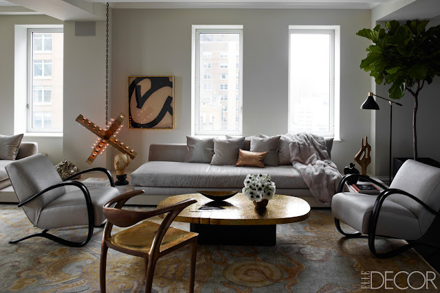
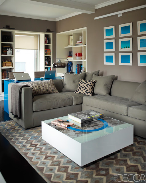
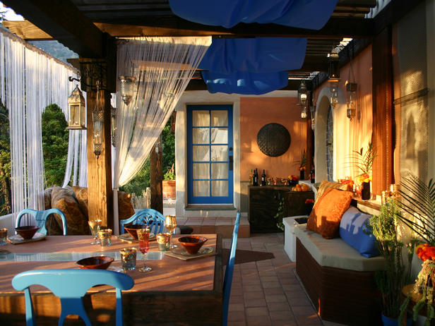
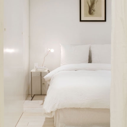
One of my home goals is to re-do our shabby sunroom into a Moroccan lounge. When I envision the Moroccan sunroom lounge I see things like: hanging lanterns, dim lights, layers of deep-colored rustic rugs, floor cushions and a carved wood daybed. As a a little homework to gather ideas for my not-yet-put-together Moroccan lounge I pulled some pictures from the web to help me, I figured I'd share them with you.
Labels
16th Workshop
A quick look
A+R
All decor
Amazon
Amenity
Anthropologie
Apartment Therapy
Apt2b
Color
Costplus World Market
Crate and Barrel
D.L. and Co.
DIY
DWR
Desk accessories
Dining rooms
Electronic accessories
Entry-way
Feng Shui
For kids
Foyer
Gus
Hallways
Home Remedies
Home office
I Stand Behind
Ikea
Item Of Note
Jonathan Adler
LA Stores
Livingrooms
Lucas Studio Inc.
MASHstudios
Mod Cloth
MyHabit
Nurseries
On Sale
Outdoor decor
Paul Loebach
Ranch-style homes
Retro
Reviews
Simplehuman
Small spaces
Sofas
Sunroom
Terrain
The Container Store
Urban Outfitters Home
Vintage pieces
Wall decor
Wallpaper
West Elm
Zojirushi
Zuo
architecture
bathroom decor
bathrooms
bedroom decor
cb2
celebrity homes
chairs
chaise lounges
city homes
country
country homes
designs
ethnic decor
floor decor
furniture
general decor
green homes
hardware
home libraries
ideas
kitchen
kitchen decor
lighting
lofts
media
modern
organizing
pet accessories
picture frames
pillows
plants
recycled items
storage
table lamps
tables
technology
throws
time-pieces
tips
unique homes
urban homes
video
wood
yard
Search This Blog
Hip & urban wall art
 |
| SAIL AWAY |
The pop-artwork of Fluorescent Palace is the Andy Warhol of today. While Warhol was at one point busy using iconic objects of the time as subjects for his paintings, creating a rather fun and poppy way of construing messages, the works of Fluorescent Palace although not as heavy-handed with the messages have gone about a similar way in creating by the use of everyday scenes, objects and high-branded fashion. Fluorescent Palace artwork is outright hip, edgy and urban resulting in a strong kind of sense in each piece that can either be used as an accessory or the focal point of any room.
 |
| RADIO CITY |
 |
| TRANSMISSION CENTRAL |
 |
| RED SEXY LIPS |
 |
| UNICORN UNIVERSE |
Fluorescent Palace is a colorful pop-art series designed to fulfill the need for fresh and contemporary decor in homes, businesses, and various spaces. Artist, Eric Haijar and Meredith Rose bring their creative vision to life with the desire to create edgy, sophisticated imagery that offers a fresh vibe and energy flow to each room. Fluorescent Palace is a combination of film based photography and design elements, coupled together to create a bright, playfully refreshing take on contemporary decor.
A+R opens on Los Angeles' La Brea Blvd
Big news of the day! Mod store, A+R has opened a new location smack dab in the middle of Los Angeles on N. La Brea Blvd. Right in the middle of clothing stores, coffee shops, restaurants and furniture stores A+R could not have found a more suitable place, except maybe Beverly Blvd but this is close enough. So for those of you decor lovers in Los Angeles there's no need to be removed and scroll through web images of A+R products no longer, the store is right in your backyard!
Don't know A+R, click here to check it out
Home Of: Ivanka Trump & Jared Kushner
Name: Ivanka Trump & Jared Kushner
AKA: Ivanka Trumpe / Jared Kushner
Date of birth: October 30, 1981 / January 10, 1981
Place of birth: New York, NY / New Jersey, NY
Occupation: Businesswoman / Businessman
Most famously known for being the daughter of Donald Trump
Most famously known for marrying Ivanka Trump
 |
| The foyer |
 |
| Living-room |
 |
| The dining-room |
 |
| The den |
 |
| Office in the den |
 |
| Nursery |
 |
| Master bedroom |
A Quick Look: Counter made of books
Over the long labor day weekend I breakfasted out then went for a brisk walk down the street that was lined with cute little stores. I walked into a Co-Op/Vintage store and saw this amazing counter supported by countless books. The books are glued and nailed together, some books were cut to achieve the proper height, the book are pushed up against a wooden structure that creates the frame of the counter while a wooden countertop serves on top. A very unique and smart way to make use of old books!
Using White
GETTING PSYCHOLOGICAL WITH ACCENT COLORS
WAYS TO USING A SECOND COLOR THOROUGHLY
PLAYING OFF THE FLOORS
USING NATURAL LIGHT ON DIFFERENT WHITE TONES TO CREATE ILLUMINATING EFFECTS
DIFFERENT STYLES FOR WHITE
USING DIFFERENT MATERIALS TO ACHIEVE THE WHITE
DINING WITH A BACKDROP OF COLORS AGAINST WHITE
REMEMBER THAT OTHER COLORS GO WELL WITH WHITE TOO
I think that the majority of the masses believe white to be not a color, although to have any hue at all including what the masses believe to be the absence of hue, white, is a color. And while most people might say that white is not a color, here are a few spectacular, beautiful, stunning and unique ways to establish white as the main color of your home or room. Boring?... Hardly!
One of the easiest ways to draw the eye to notice white is using accents, you may think this absolutely absurd because the whole point of using accent colors in the home is to draw attention to the accent color. Actually, one can use accent colors to cheat the brain of the viewer by giving the viewer a color to compare (via contrast) the white to, hence the white will seem whiter and the viewers will see 'that yellow wall in the all white room'.
In conclusion, using a color accent in a counter-intuitive manner will draw attention to the white room, this kind of reverse psychology play with the use of colors goes for all colors and not just white, although I find it to be most intriguing with white since it seems to have the biggest affect- POW!
In conclusion, using a color accent in a counter-intuitive manner will draw attention to the white room, this kind of reverse psychology play with the use of colors goes for all colors and not just white, although I find it to be most intriguing with white since it seems to have the biggest affect- POW!
 |
| The natural redbrick wall between the windows is being smartly used as an accent wall. |
FAVORITE!
 |
| Another way to use accent colors is through the use of the floors, in this case the kitchen floor is black and white checkered highlighting the white everywhere else. |
WAYS TO USING A SECOND COLOR THOROUGHLY
PLAYING OFF THE FLOORS
Floors matter a great deal, they take a great amount of space in the house and because of this one simple fact (although probably not the only one) makes floors something to be respected, noticed and regarded when creating the interior style for your home or room.
USING NATURAL LIGHT ON DIFFERENT WHITE TONES TO CREATE ILLUMINATING EFFECTS
 |
| The absence of any other color in the room together with white walls that holds more warm tones when lighted up creates an ethereal effect that is fantasy-like and heavenly. |
I have a Marmalade orange office that looks dark orange in the evenings and very orange during the day, this change in color due to the changing natural light occurs with all colors, including white. While many try to pick colors as accurately as possible keeping in mind natural light and its affects on the colors of the walls many do not think that this affect is also interesting to play with. However it can be quite beautiful and smart when used to your advantage.
DIFFERENT STYLES FOR WHITE
FAVORITE!
USING DIFFERENT MATERIALS TO ACHIEVE THE WHITE
One mustn't forget other materials that can help you achieve the white room, this will also add different textures to the room which can be quite satisfying. Sometimes all white rooms with lack of textures from lack of different materials present can result in a washed out interior style, in other words, boring. Then again, sometimes this is exactly what the doer wants- which is fine if that is the overall look you're going for. I find that while it may be more difficult to use different materials in the living room, dining room, entry and bedroom the kitchen and bathroom are two spaces where using different materials is quite easy, all that countertop, sinks and backsplashes are all just asking for it aren't they? And the end result is always so charming.
FAVORITE!
DINING WITH A BACKDROP OF COLORS AGAINST WHITE
FAVORITE!
There is nothing like a rainbow of colors to serve as your accent wall to remind you that you're surrounded by white.
REMEMBER THAT OTHER COLORS GO WELL WITH WHITE TOO
 |
| The use of purple with white is very romantic and unique. |
Many seem to jump to black or brown when highlighting white, black probably because it's the exact opposite of white and everyone likes stark contrast to make a statement. Brown is often used as well most likely because everything goes with brown and also it's a very good way to keep things grounded and earthy if that is the kind of style you gravitate towards. But I'm here to tell you that there are tons of other colors that go well white... like every other color, I mean this quite literally. Many believe that white is the absence of color, this actually is not true- black is the result of absence of color, white is the exact opposite; white is the result of the combination of all colors, hence my theory that white goes well with every color.
 |
| The use of yellow results in a fun and quirky atmosphere that screams "easy going!" |
Subscribe to:
Comments (Atom)


