Arroyo salt and pepper block


As a person who cooks for stress-relief, eats for stress for relief (which by the way is bad bad bad!)  And loves to maintain the home with the appreciation of certain luxuries I can most definitely find a space in my heart as well as the dinner table for the Arroyo Salt And Pepper Block.  As sanitary and traditional it is to use salt and pepper shakers I never was one who liked them very much, the constant repeated wrist shakes one goes through to get the perfect amount of salt and/or pepper grains out of them tiny holes always seemed ridiculous to me, hence my immediate love for the Arroyo Block which allows you to dip your fingers and pinch just the right amount and sprinkle it with ease.  And of course it also gives a completely different look to your dinner table, and I mean "different" in a positive way.


Arroyo Salt & Pepper Block $45 @ Amenity


The view above


Perhaps I haven't had the chance to think of focusing up high, I think that is probably one of the draw-backs of living a life in a rental- you never truly believe the space is wholly yours, so... you keep your sights eye-level, as I have; decorating before me and not over me.  Thus, I found Elle Decor's article "High Design" intriguing as it opened my eyes to what is literally, above me, the ceiling.


I Stand Behind: Silicone Mini Mitts with Raised Nibs


Fennel-Green Silicone Mini Mitt with Raised Nibs $5.99 @ Sur La Table


I'm sure you and I both feel the same way about burns, we hate them!  I hate the fact that my oven mitt needs to be layered with an extra cloth that is usually the kitchen towel and the matching pot holder that came paired with the oven mitts.  The custom is to put on my oven mitts then grab the pot holder and the kitchen towel and then precede to remove my baked dish in the oven, even still you can feel the heat penetrating through the cloth getting closer and closer to your fingertips- at which point you begin to panic, frantically searching to place your baked dish down... I hate this, you hate this- you know what I speak of.

It's been roughly over two years since I first bought a Silicone Mini Mitt with Raised Nibs (as shown above).  I do a fair amount of cooking so I find myself to be a reliable source to tell you, if you cook often you must throw away your old mitts and invest in this great invention, a silicone mini mitt, your fingers will feel safe!  This is how it goes...  My apples have been baking in a dutch oven for the past hour and half in the 350 degree oven, the timer goes off, I grab my silicone mitts and grab my dutch oven and calmly place it on top of the stove to cool.  No extra cloth is needed, you can literally hold the piping hot dutch oven in these simple silicone mitts and feel absolutely no heat!  I suspect it has something to do with the raised nibs, but I'm not quite sure what- nor do I really care, I'm just very happy about the silicone mitts.


Pictures doing half the work


I am a picture person myself, and by pictures I don't mean putting family photographs up on the refrigerator, by pictures I mean framing, colors, astounding, eye-catching, something to accent the room in which the picture is placed, a picture to help set the area and the mood.

Being as penniless as I am I tend to buy pictures, painting or photographs that I really love and know will look great in my home, and being penniless as I am they tend to be frame-less, so then the next step I take is to frame them.  I found that the cheapest way of doing this is to buy everything yourself and do it yourself, honestly, it really isn't that hard, after framing two you'll be a pro.  In the past I spent close to $300 getting one picture professionally framed, just recently I found myself at Michael's during a frame sale and was able to buy a frame and a custom cut border mat all for $30.  And though some find it hard to believe that framing yourself will be enjoyable, surprisingly it is, being part of the project at such an in-depth level from start to finish and having such control of the project is enjoyable... well, I tend to think so anyways.

The final step and what I find to be the most important step, placement.  A lot of the time many people like to hang pictures at the center of the largest bare wall they have and though at times this is the perfect place for pictures it doesn't necessarily mean it's the right place for that particular piece.  But don't be disheartened, there is no right or wrong place to hang that black and white photograph, or colorful oil-painting, or print.... Simply, stand back and slowly take a look around, look at the spaces and how the piece would look there, or there?  How will it enhance the space?  How will a visitor come to pass to see this particular piece in this particular space?  At this time remember that when you are hanging your beautiful artwork it's not just about the artwork but about the entire space, the entire room- very similar to cooking I'd say, many ingredients are used to make one delicious dish!  

And though it may seem like a lot just to hang one picture, in the end it'll be well worth it.


*pictures from Elle Decor


A high-style sunroom


Just recently I did a post on sunrooms/solariums, "oh how I wish to have one" is a gist of the post followed by a few pictures (as usual).  Then I saw today this high-styled sunroom in Elle Decor and just had to share it!  Look how lovely it is!  The green accent decor along with the large lush trees, vintage pictures and white chandelier really is an eye-opener to how far you can take your sunroom/solarium design.


A restaurateur's haven in Martha's Vineyard


Children's bathroom

I've heard of Martha's Vineyard quite a bit in passing but never really knew what or where it was, but now I know, in a nutshell, Martha's Vineyard is a haven.  A place where one keeps their vacation home, a place where it is quiet and green, sounds like my kind of place.  Here are some beautiful pictures I found at Elle Decor of a New York restaurateur's home in Martha's Vineyard, really very beautiful.


Banquet dining table in the kitchen

Sitting room in the kitchen

Study located on the 2nd floor

Kid's room

2nd kid's room

2nd floor hallway

Patio

The berry garden

The main garden where tomatoes and asparagus grow

The guest cottage

Extraordinaires On Sale


East Bali, Indonesia 6,740 sf @ $3 million

Exeter, Rhode Island 3,450 sf @ 1.35 million

Things over-looked are NOT over-looked @ Modcloth

Bike on a Hot Tin Sign @ Modcloth

I recently went over to a house-warming party of a friend of mine who just bought his first home, being the tree-hugging kind of guy he is he doesn't own a vehicle and instead bikes around town.  His bicycle was parked and locked in front of the open garage, when I saw this I suggested to him to get his own bike rack and thought how cute that would be, then I saw this Bike on a Hot Tin Sign at Modcloth.

I own a couple of bicycles and park it in my mudroom, I know exactly where this sign is going.


Ready, Set, To-Go Menu Organizer @ Modcloth

In my kitchen I have a designated junk drawer full of take-out menus, they're usually thrust into the drawer with not a care in the world resulting in crumpled and now a hard to open drawer, as a result of this chaos I took out one of my old school binders and made a to-go menu folder.  It really was a great idea but it also took a little bit of time since I wanted the to-go menus organized geographically, Chinese, Mexican, Italian, American and such.

If you've got the same to-go menu drawer issue but don't have the time to put the binder together yourself look to Modcloth who didn't overlook this problem.


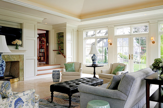
The Sunroom


 When I think of my dream home, which quite often changes form, there's one thing that always remains the same, that it will include a sunroom.  I've never grown up in a home with a sunroom before but I have a fascination with them all the same.  The concept of being able to enjoy a scenic view from right inside your home is fantastic, the concept of having a specific room in your home to collect warmth and light is also fantastic!

I used to think of sunrooms as an elderly-type of thing but today I see they can be quite modern and can be decorated pretty much any which way to your liking.  Here are a few sunrooms I thought were worth looking at, really, they are beautiful! 


New System 1-2-3 Lounge Chair @ DWR


Designed by Vernor Panton the new System 1-2-3 Lounge Chair (pictured is the deluxe leather) just came out at Design Within Reach. Breathtakingly beautiful.

$4,300.00 in Deluxe Leather
23.5"wide 32"front to back, 14.5"seat from the ground, 34"tall


To view other new items at DWR please click here

Structural Visions of Kengo Kuma


I recently saw a picture of a glass/wood house that Kengo Kuma had designed and was completely blown away by it, it was after this short sweet introduction to his work that made me curious about this Japanese born architect who in my mind is a real genius.  His works are innovative, fluid to the eye, almost always modern and alien in comparison to other architectural styles.

A modern bedroom with the bathroom surrounded by glass walls

A somewhat traditional bamboo bathroom in modern style


A shop he designed with honey comb wood structuring


A meeting table out on an island surrounded by glass walls

LinkWithin

Related Posts Plugin for WordPress, Blogger...