Thanks to another great blogger, Lori of Automatism, who posts absolutely wonderful pictures of most everything, and yes, even the inside of beautiful homes, I was introduced to Mi Casa Revisita, a site concentrated on everything interior (also where the images of today's posts are from). Mi Casa Revisita is in Spanish but I'm sure you will be able to find your way around the site, with just a little bit of Spanish such as "bano", "casa", "terrazas" and such words it is simple enough to navigate through the site, however reading the actual articles may be another ball-game.
"House of the Free Spirited" as this house is so aptly named is breath-taking but not in the romantic sense of the word, breath-taking in a sense that the mixture of contemporary, minimal and spanish style of the house is so well integrated together that one can't possibly imagine topping it. I absolutely love being taken in surprise (assuming that the surprises are good of course) and The House of the Free Spirited did exactly that with it's mix of rustic, modern, vintage, and contemporary pieces all against the backdrop of a minimal and modern home.
I think that very often when trying to decide what kind of look you want your home to be many get caught up in sticking to one look whether it's minimal, modern or rustic, etc. I suppose it is safest to do so, but in this case I feel like going with how one feels, what one likes in a single piece and incorporating that into the home regardless of it's interior genre has worked greatly to the benefit of the big picture.
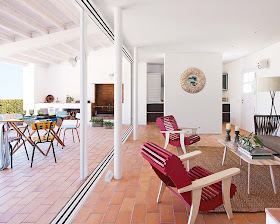
(Above image) - I love that the tiled flooring is continuous and the same from the inside of the house to the outside, it gives a free flowing vibe that not only makes this small house seem even larger than it is but also a feeling of balance and connection between the inside and outside of the house, hence I suppose the name of the house, "House of the Free Spirited".
(Above image) - the use of rustic colors that are dabbled about the entire interior (the basket in the corner, the teal on the shelves, the colors of the picture above the sofa, the red of the wooden chairs) brings life to what other-wise could have been a rather drab interior. Sometimes when given an empty space, in this case it would have been tiled floors and white walls, it can be hard to imagine the space at it's best- I think a wonderful job was done here with the inclusion of different colors probably not normally used especially given the spanish-colored tiles (such as the bright red wooden chairs) which actually gives it the right amount of pop needed for the look of the room as whole.
(Above image) - here is an image that epitomizes the whole reason why I love this house so much, the use of different interior genres that just seem to go curiously well, the rustic table and vintage chairs with a backdrop of a very modern and minimal kitchen.


