Anthropologie Item of Note: Talon Candlestick

Talon Candlestick, Tall $58


It's a little disturbing but that's why I love it so much!  The rustic yet witty and cute talon candlestick holders are today's Item of Note from Anthropologie.


Warehouse Homes


My friend is moving into her art studio, a warehouse-type of place... No, not a warehouse-type of place, it is a warehouse, but with separate rooms here and there.  She writes to tell me it's a bit tricky making it home as it truly is a warehouse.  Granted there are some limitations to transforming this new abode into her comfortable home since it is not zoned for living quarters but I still believe the possibilities are endless.

To think that you can only have a modern or minimalist interior decor theme because your living in an outright urban space such as a loft or a warehouse-styled abode is completely wrong.  Quite often a charming country decor in an urban space results in a unique and beautiful look. There are no rules, and above all there is nothing to stop you, except you, of course.


Below is a warehouse-styled loft space where "work" seems to be the focus.  Minimal space is left for those personal belongings one loves so much:  the line of books in the hall to the right, an armoire off to the corner on the left.  The long wooden work table at center, I absolutely love, and with the minimal-style vase of flowers the area exudes just the right amount of touch of home.


Large spaces like those you see in warehouse abodes can be transformed greatly by the use of area rugs, which can give the space a feeling of warmth.


If you have plenty of wall space try a blown-up wall-sized photograph, print or painting.  If a specific theme is in the making for your over-all decor a wall-sized picture suitable to the theme can really give it the boost it needs.

I Stand Behind: Soap dish sponge holders!

Ceramic Bird Soap Dish $4.99 @ Cost Plus World Market

Why is it that I can never find a kitchen sponge holder that is pleasant to look at?  My sister has a very good kitchen sponge holder, it's plastic like all other sponge holders and has a suction cup to suction it onto the inside of your sink, this way your counter doesn't get cluttered will all the kitchen accessories.

I acquired the trick of using a soap dish as a sponge holder quite by accident, actually, it's not really a trick at all, but it's still the greatest thing ever!  I went to a yard sale one day and bought a very cute soap dish in the shape of a claw-foot tub, I don't use bar soap however but couldn't refrain from paying $1.50 for this very cute thing.  So there I was in my apartment hunting for a place where I could utilize the claw-foot tub soap dish, I tried putting little trinkets in there, then I tried putting the rings I wear daily in there for easy access - beats rummaging through the jewelry box every morning, I thought.  And with everything I tried none was all that satisfying and so I left it aside.


9:00 P.M.

I stand at the kitchen sink doing dishes, the last dish put away, I swipe the inside of the my sink clean, do a spray around, squeeze all the water I can out of the sponge, turn off the water and... no where to put my sponge.

A light bulb goes off!  Of course!

I set the claw-foot tub soap dish next to my sink and place the kitchen sponge inside, perfect.  AND!  The best part of it all, the claw-foot tub soap dish turned sponge holder is darling!  Now how many sponge holders can you say that about?

The Colorful Kitchen


I think that for many people incorporating bright colorful tones into one's decor is hard, we have gotten used to the earth tones, the modern black and whites and what not.  In the back of our minds perhaps we feel that using bright colorful tones is a risky business, that incorporating bright colorful tones is much harder than matching earth tones of wood and more wood and so have been careful to stay away from color, and if we do find courage to use color in our decor it's in the form of a framed picture, a vase full of bright flowers, an area rug, a throw pillow or two.  But never in an all encompassing form where color itself is the high-light of a room.

Should you be a person that have carefully stayed away from risk but feel the courage and want to do more with bright colors perhaps it may be a great idea to start in the kitchen.  Kitchen, a place where one creates for the delights of the palate, I really cannot find a better room to try something new and creative and out of the ordinary.  I have gathered a few pictures to give you an idea of all the things that you can do with... color.

A safe way to use a load of color without much risk of really screwing things up is using simply one color.  


Using simply one bright color will lend itself to a more modern look.


Please note below, the kitchen floor is also painted blue.


Take into consideration the color and material of the floor.


What will make your kitchen pop and really feel fun?  Play around with the wall tiles.


When planning color for your kitchen take into consideration the cabinets and drawers, below is a picture of a kitchen painted a light sky blue which goes wonderfully with the off-white cabinets lending a charming homely look to the overall appearance.


Then there's the use of uncommon, deep, saturated colors.


Try color-blocking for a more retro appearance.


Even small kitchens can have their fun.  With smaller kitchens or even kitchenettes stick with a one color scheme for the walls, having more than one color on the walls for smaller kitchen will make the area look smaller.  If this disappoints you, don't be, you can always play around with the cabinets and floor!

I Stand Behind: Wood Baskets

Sedona Large Tote @ Crate & Barrel


I live in a 900 square feet apartment, that comes to approximately one bedroom, one bathroom, one living-room, one kitchen and one mud-room, don't get me wrong, I'm not complaining, merely trying to prove a point.  The point is, when you and your significant other live in a fairly small space you learn how to consolidate, arrange furniture and most of all... use the space that you've got.  If I've learned anything from this trying but happy existence it is that one should always make use of the space they have.

I'm in love with my bathroom, almost as much as I'm in love with my kitchen, my bathroom is made charming with it's 1920's subway tiled walls, pedestal sink and built into the walls underneath the windows are cabinet drawers.  And though it seems we have plenty of drawers there doesn't seem to be quite as much space as I hoped.

I use brown wood baskets to hold my neatly folded towels, it could not have worked out better.  What seemed to me a slight travesty my first day of putting bathroom supplies away upon my move-in to this humble abode became something really great.  My towels are always neatly folded and always out for an easy grab, the basket of neatly folded towels lends a charming and warm feel to my bathroom that I absolutely love.

If you find yourself out of space whether it's in the bathroom, living-room, kitchen or bedroom have a wood basket in mind.  You can easily store magazines and newspapers beautifully near the fireplace, or even throw pillows near the couch.

DWR Eames Lounge & Ottoman gets a boost


DWR's Eames Lounge & Ottoman can very well be known as the "face" of DWR.  Since the Eames Lounge & Ottoman introduction in 1956 it has continuously been in production and just recently the lounge and ottoman has produced a new addition in White Ash and Pearl Leather, giving it the ultimate modern oomph, not that it was much needed.

View more details on the Eames Lounge & Ottoman


Please wait in the foyer


*Merriam-Webster
Definition of Foyer:

: an anteroom or lobby especially of a theater; also : an entrance hallway: vestibule


Foyers, if you have one and most likely you do, whether it's a long or short hall or even just a small space it's a great area to get creative.  Foyers are the first thing your guests will see and so in this way the  space is important, what do you want the first impression to be for your companions when they walk into your home?  Here's a few ideas to spark your imagination.

With bigger boxy spaced foyers the general trend seems to be a center piece, this usually includes a table and a center pendant lamp.

In this picture the pendant lamp and the choice of table topper (tall plants) are the center of attention

In this section of large boxy spaced foyers, pictured below is my favorite concept, adding the usual center piece table under the large pendant lamp, then untraditionally using the foyer table as a study with an armed chair.


A more contemporary approach: terrariums as table toppers & large circular pendant lamps


When you begin to plan a design for your empty foyer, stand in the space and take a look around, sometimes it is best to make the center piece that which is already there.  Below is a picture of a foyer space where the front door is placed right across from the beautiful family room, in this case putting a table topped with a center piece would have a cluttering affect as the room behind is already well decorated, and so appropriately they left the foyer as empty as impossible and instead added a side wall table and a chair next to the doorway of the room, resulting in a very elegant design.


Keep in mind that the foyer decor and design you pick for your home should go along with the decor and design of the rest of your home.  If you have a Japanese themed design in your home do not decide on a 1950's vintage design for your foyer, remember that the foyer is very much like a prologue to a book, an introduction to your home, so the tip here is:  When designing your foyer do not concentrate on only the foyer, but also take into consideration the rest of your home, consider the transition between the foyer and the next room beyond.

Asian inspired foyer
Zen inspired foyer

Play with what you've got.  If there is a key feature of your foyer that you are really taken with, play off that feature and build your design around it, this will help to enhance that key feature as well incorporating it well into your design.  Pictured below, the foyer plays off the shiny tiled floor by adding a lacquered table and glass lamp, carrying the shine and gloss throughout.  Another key feature in the below foyer is the Black framed entry door, the color is carried throughout the foyer in various places:  the black lamp shade, the black table topper and the black framed wall mirror.


Key features in this foyer are the white stair rails & white wall boards.

Look down!  Take a good look at the foyer floor, is it wood?  Tile?  What color is it?  If you have on your hands a great looking foyer floor, use it to your advantage!


I love the use of contrasting colors: the yellow
striped walls and the black checkered flooring
Note: the handrails & picture frames are also black

I love this modern vintage tiled flooring and the color of it too!

You can always go contemporary modern.  Newer home structures today lean towards a more modern and sleeker design architecturally, and that's okay because a modern look for your home can be pretty amazing as well.


Maybe you are a dreamer or have an excess of personality, whatever the reason may be, don't rule out having fun with your decor/design.  Designing your space is very much about how it makes you feel, this is your home after all and though you may want to impress your guests remember that you will be walking in through that door more times than anyone else, so the tip here is:  Design your space for you.


I love smaller spaces, I feel more at home in cozy small spaces with charm.  A smaller space doesn't mean you don't have a choice or that you can't design your foyer to your liking, obviously there are some limitations- like space, but trust me, there is always something that can be done.  

The color of the walls is a key element here.
Consider repainting smaller spaced foyers to add the illusion of a bigger space
or for a splash of color!

Don't forget about the nooks and crannies, great things can be done with them.

And remember that "charming" goes well with small spaces

Anthropologie Items to Note ON SALE: Tall Espresso mug & colorful Wingback

Howell Wingback, Linen $1,898
41.5"H x 31"W x 35.5"D / Seat: 19.5"H


A couple items to take note of that is eye-popping and can be deemed beautifully eccentric are the Linen Howell Wingback in bright orange, definitely a must-have for those lovers of vintage modern items.  And, the unusually tall Seawater Tall Expresso Mug for those of you who just won't do with a single shot in the A.M.  Two items that are common and yet unique will definitely contribute something special to your home.


Seawater Tall Espresso Mug $10
6.25"H and 2"diam


View Anthropologie New Items

Design & Decor in Film

I have watched films such as Marie Antoinette, Amelie, Iron Man amongst others countless times, I find myself lost in their world and I don't mean the film itself but the design, costume and set.  Below are a few pictures and the films which you can see these beautiful designs and decors in.


Tony Stark's home in the film Iron Man

The interior design inside the Iron Man house *note the water glass along the staircase

Wide view of the Iron Man house


Kevin Flynn's home in Tron Legacy

*Note the futuristic design & modern contemporary decor


The Mendrakis' house in When A Stranger Calls

Exterior wide view of the Mandrakis home


Holly Golightly's flat in Breakfast At Tiffany
*Note the tub sofa design


Amelie Poulain's flat in Amelie

*Note the use of color and the two framed pictures above the bed

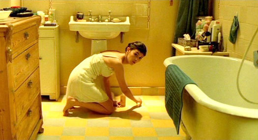
Amelie's bathroom is one of my favorite of all time *Note the use of individual standing dresser & tables


Marie Antoinette's home in Marie Antoinette

*Note the design of the wall paper

*Note furnishings & decor of that time period

Marie Antoinette's cottage built just for her